Visualize Your Research

How can we visualize scientific data as a way of informative storytelling? The Summer Series “Visualize Your Research” – a joint event of DWIH Tokyo and DWIH New York from June 22 to August 21, 2021 – addressed this and other questions. Students from the US, Germany and Japan had the opportunity to expand their knowledge in data visualization, to learn about applications to their own research and to build an international network.
Data is everywhere – but how do we visualize it?
Data and numbers surround us everywhere we go and accompany us in our lives. We see them in the news of course, but they also play a major role in our everyday decisions. When grocery shopping we look for the amount of protein in our milk, check the success rate of our newest cosmetics or go online to find the hair salon with the best average ratings.
In science, too, it is important to clarify the intended statements precisely and in a way that it can be understood by everyone at a glance. The best research design and complex data collected in a cumbersome manner lose a large part of their significance if their visual presentation and design does not convey the main results to the public or scientific community. In public, in presentations or in articles for colleagues, it is crucial to present data and research designs visually in a way that makes them accessible for everyone.

"Instead of using data to become more efficient, we will all use data to become more human"Georgia Lupi (Information Designer)
The human side of data – lecture by Georgia Lupi
On June 22, 2021, Georgia Lupi’s lecture kicked off the Summer Series. Lupi is an Italian information designer and expert in the field of data visualization and is particularly known for her human-centric approach to data visualization.
In her talk, Lupi calls for a “Data Humanism” that focuses on the human side of data and its representation. To do this, she takes an artistic approach and introduces new, creative methods of visualizing and using data. As she says in her talk, “Instead of using data to become more efficient, we will all use data to become more human.”
The artworks that Georgia Lupi creates with data can be found in the collection of the Museum of Modern Art. A recording of Georgia Lupi’s talk in the Summer Series is available here.
Datavizzers – Creating own projects and trying new things
In the second part of the Summer Series, the participants were able to use their acquired knowledge by creating their own projects under the guidance of Daniel Sauter. Sauter is an associate professor at Parsons School of Design and the director of the Data Visualization Program. He works on new ways of communicating science and software for visualizing data.
Participants gathered in groups at the beginning of the second part of the Summer Series to work together on a visualization project. With the help of Sauter, whose students at Parsons School of Design regularly create and present data visualization projects, participants were able to take the first steps of such a project themselves. Sauter also demonstrated various data visualization software in his workshops and provided initial insights into their use.

Let’s hear from the participants
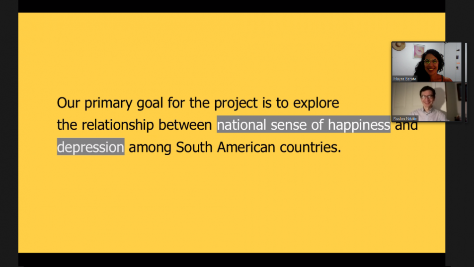
Mayra Barata and Ruslan Nikitin participated in the Summer Series and look back on their experiences together in this interview.
Mayra Barata is a master’s student in nutritional sciences and epidemiology at the Sao Paulo Medical School in Brazil. Due to her current research projects, she deals with data and its analysis on daily basis.
Ruslan Nikitin is a health policy analyst at the Clinical and Translational Science Center at Harvard Medical School. His work focuses on effectively translating research into policy and practice and he is interested in how data visualization can be used effectively in this context.
In implementing their visualization project during the Summer Series, the two were united by their interest in health issues. Therefore, they focused on the relationship between national happiness and the prevalence of depression.

Mayra, Ruslan, why did you decide to participate in the Summer Series?
Mayra: For me it was mainly curiosity. Even though I deal with data every day in my research, I never really learned how to properly visualize it. We really just reproduce what we see everywhere: Graphs and tables. I was curious to see what other ways there are to represent data visually.
Ruslan: I analyze health policy and public health data, so during the Summer Series I wanted to learn how to translate data and study results using visualization in order to make them more accessible to the public. For me, data interactivity, different perspectives, and empowerment of diverse communities through research are important. I think visualization can become a bridge for doing so.
How will you use the skills you learned in the Summer Series in the future?
Mayra: I will definitely share my knowledge from the Summer Series with my research group at my university. We have been looking for new ways to reshape the data we collect for some time now. When I finish my master’s degree, I also want to pursue the many other ideas and approaches that Daniel Sauter has shown us.
What point did you like most about the Summer Series?
Ruslan: The workshops with Daniel Sauter were very helpful. As a researcher, I have a more pragmatic approach to data visualization. Daniel Sauter gave a lot of valuable input on our project with his unique perspective on creativity and design as being important aspects in the data visualization process.
Do you have a “lesson learned” or a particularly important insight that you took home from the Summer Series?
Mayra: I don’t know if this is not a bit cringe, but I would say: “Everything takes time.” Any form of science takes a lot of time and effort. Especially visualization looks so simple, but there is a lot of effort behind it.
Ruslan: I really enjoy data visualization. It’s like science and creativity getting married.
Text: Lewis Allen Erckenbrecht (DWIH Tokyo)
